This blog post is in relation to the Assignment on Page 47 of the OCA Photography 1 - TAOP course material.
Going through all my previous photographs that I have taken over the years, I really struggled to find any that would fit the description of contrasts. Having only recently started to take my photography seriously, I have hundreds of old photos that just standard snapshots of people or places, but none that could be categorised as representing one theme or another. A good indication of how lacking in direction and purposed my photography was before starting this course.
However I did manage to find a couple of contrast examples, which can be seen in this Flickr set.
Having found out just how aimless my photography has been, I was looking forward to this assignment, about planning and thinking of various ideas that would best suit each of the contrasts from the list, and about trying to take photographs with purpose and meaning.
Some of the themes gave me ideas straight-away, such as the water drops for liquid, and the traffic trails for continuous, and they had natural opposites such as ice for solid. Others were not so easy to think of so I had to wander around looking to different things, trying to think of them in ways that made sense of one of the contrast list.
Overall, I think the photographs are good representations of the ideas and concepts they were trying to achieve, although I am pleased with some more than others. I am particularly pleased with Continuous and Pointed as they best show what there are supposed to represent.
If the thumbnail links are missing, view full images on the Flicker set for this assignment.
| TOAP-Part1-A-1 Dark |
f/5.6 1/8sec ISO-250 45mm(67mm equiv)
The background and the table are still very dark even though there are three candles, showing just how little light is emitted from the bright flames.
| TOAP-Part1-A-2 Light |
f/5.6 1/125sec ISO-250 55mm(82mm equiv)
I tried many different exposures of this bulb from a table lamp with varying levels of brightness. I like how the glass gives the impression of an aura of light around the filament.
| TOAP-Part1-A-3 Heavy |
Heavy
f/5.6 1sec ISO-200 52mm(78mm equiv)
The uniformity of the rust on the hammers almost makes them seem
like one large piece of metal, adding to the sense of weight.
like one large piece of metal, adding to the sense of weight.
| TOAP-Part1-A-4 Light |
Light
f/5.6 1/3sec ISO-250 40mm(60mm equiv)
Here I have tried to indicate the weightless nature of the
feather by resting it gently on a dark fluffy cushion.
feather by resting it gently on a dark fluffy cushion.
| TOAP-Part1-A-5 Many |
f/5.6 1/100sec ISO-250 55mm(82mm equiv) +Flash
I had a problem with the flash bouncing off the face of some these coins, so I cut a small slot in a piece of paper and placed it over the flash. I think this gives the impression of looking into a treasure chest, and the way the coins extend beyond the strip of light, and even beyond the frame give the feeling of a large pile.
| TOAP-Part1-A-6 Few |
f/5.6 1/2sec ISO-250 52mm(78mm equiv) +Flash
By showing that the coin is the only one in the pocket, it emphasises feeling of having so little.
| TOAP-Part1-A-7 Pointed |
Pointed
f/5.6 1/200sec ISO-200 32mm(48mm equiv) +Flash
It's not just the recently sharpened pencil that is pointed, the shavings all have a pointy bright yellow edge to them.
| TOAP-Part1-A-8 Blunt |
Blunt
f/5.6 1/4sec ISO-250 55mm(82mm equiv)
Even though the matches are long and thin, the round heads and grouping
them together changes the overall shape to a flat object.
them together changes the overall shape to a flat object.
 |
| TOAP-Part1-A-9 Liquid |
f/5.6 1/1000sec ISO-1000 34mm(51mm equiv)
This shot took a lot of trial and error before I got a crisp clean image with a sense of movement and fluidity.
 |
| TOAP-Part1-A-10 Solid |
f/5.6 1/200sec ISO-200 55mm(82mm equiv)
I think most people will automatically think of solid ice as a contrast to liquid, and by using a recognisable shape it gives a sense of a solid object rather than frozen water.
 |
| TOAP-Part1-A-11 Diagonal |
Diagonal
f/5.6 1/5sec ISO-250 52mm(78mm equiv) +flash
By showing the dog sat upright, you can tell that this is truly diagonal and not just a tilted shot. I like how the dogs body disappears behind the line, adding to the harsh divide.
 |
| TOAP-Part1-A-12 Rounded |
Rounded
f/5.6 1/2sec ISO-250 30mm(45mm equiv)
The rings within the logs add to the round shapes dotted throughout the picture. Converted to black and white and boosted contrast in post production to emphasis the rings.
| TOAP-Part1-A-13 Continuous |
f/29 15sec ISO-200 26mm(39mm equiv)
I've wanted to try one of these traffic trail photos for a while so this was the first thing that sprang to mind when thinking about 'continuous'. The wall of the bridge was higher than was ideal for the tripod so I shot this in hand whilst resting on the wall.
 |
| TOAP-Part1-A-14 Intermittent |
f/5.6 1/30sec ISO-200 55mm(82mm equiv)
The almost random layout of the car lights and lack of visible road markings makes for chaotic indeterminacy.
 |
| TOAP-Part1-A-15 High |
High
f/7.1 1/200sec ISO-200 55mm(82mm equiv)
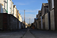
The simplest way of achieving a sense of height is to take a photograph above normal eye level, looking back down at the ground. So with that in mind the view from the back bedroom window seemed ideal.
 |
| TOAP-Part1-A-16 Low |
Low
f/13 1/200sec ISO-200 32mm(48mm equiv)
The same back street from ground level, lower than normal eye level and looking up
 |
| TOAP-Part1-A-17 Black & White |
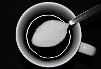
f/5.3 1/60sec ISO-200 40mm(60mm equiv)
I wanted a monochrome looking effect to this photo, so I arranged some white sugar over black coffee in a white mug sat on a black chopping board. The circular reflection from the flash was an unexpected bonus.


